Hello! It’s simple, really. I’m not the best artist, but I sure do know a thing or two about art! I will give honest and truthful feedback. Post your art on here for answers on how to improve or just an opinion! I’ll point out the things I’d say to improve on, give an overall view on the work then finally give some extra tips. This includes videos and pictures of what I myself have used to help me draw and become a better artist.
Please don’t hesitate to ask for feedback! I’ll be honest and teach you to improve!
Anyway, post away! I’m pretty free at the moment and will give 100% honest reviews of your art.
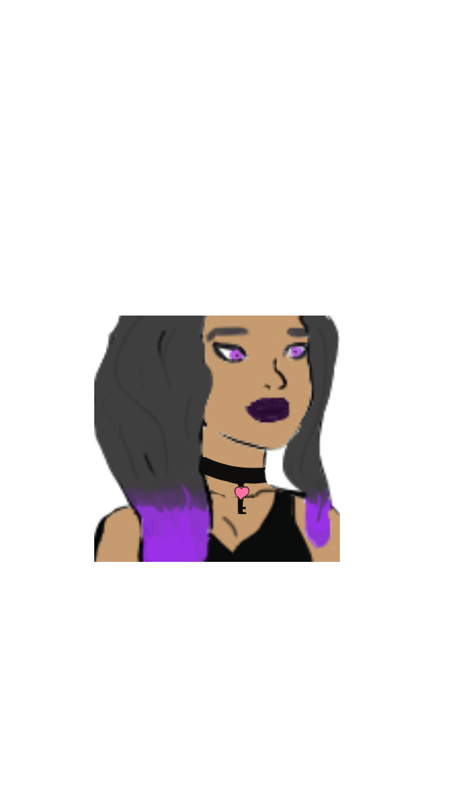
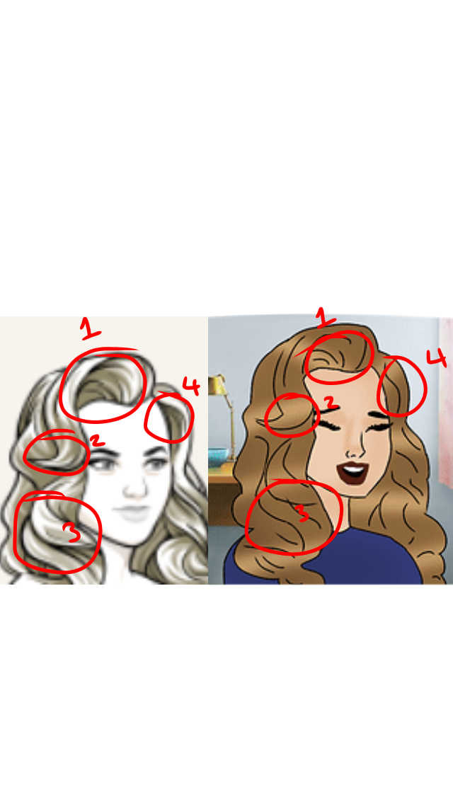
1. The hair looks a little off to me. I think you need to draw sections of it, and not just the outline, like this:
Just remember to draw sections of the hair.
2. The hair shading looks a little off too. Instead of putting random bits of light brown, do it so it makes sense. For example, where the light is hitting the character, draw the light there.
All art above belongs to their original owners. I don’t claim these to be mine.
3. Instead of using a white airbrush, or whatever tool you used to do the hair lighting, you could use a harder pen. The airbrush is totally fine to use, as long as you use it efficiently.
good work.Never seen such a honest and detailed art review thread.but below is just a kind advice.
I’d suggest you to change your tittle in to something sofisticated, brutal seems a bit too rude.that may prevent a lot of beginners from asking reviews from u.The ones who are a bit sensitive towards their art but still want to improve.try words like no sugarcoated reviews or just ItarraAki’s honest reviews etc
Thank you so much! Also, I put “brutally honest” because I’m being as honest as I can. If someone finds my feedback rude, well, it’s because it’s honest.
The poses do look a little off. Remember, if you’re a beginner then it’s perfectly fine to use bases! Just make sure you 1) Don’t rely on them too much, 2) Actually learn from them, 3) Always give credit, 4) Never use for commissions!
Here are a few poses I found that would match your drawing!
Clean up your lines, and make them less wobbly. Use the stabilizer if working on Ibis Paint X. I’m not familiar with other art formats, but remember to always try and look for some type of stabilization!
Lastly, the faces look a little strange. I’d recommend choosing the facial feature you want from the Episode character, screen shotting that, then tracing over it using a hard and fine pen with the stabilizer on.
The only thing which looks a little off is the anatomy and the pose, but it was free handed so well done!
The hand and arm is a tad bit wobbly. I’d just recommend either make sure the arm proportions make sense (so the end of the arm, near the hand, is thinner than the upper end of the arm etc) Unless your character purposely has a small waist, then I’d suggest looking at female body poses to see the average waist that won’t look strange - since this is a hand drawn pose and not an Episode traced one.
That’s all I’d say, really! The shading and lighting is amazing!
It does look like an Episode INK edit, so I’d suggest using a finer pen (if you’re on Ibis Paint X, the dip pen hard is recommended) and tracing the facial features as closely to the Episode INK character as you can.
Clean up your lines so that they aren’t randomly thicker in one place and thin to the point it’s invisible in another place etc
I’d recommend using the stabilizer to straighten out your line. Put it on 4 or 5 (This all depends if you’re using Ibis Paint C) If not, look for some sort of stabilizer on the art format you are using! Like this:
The hair looks a little strange - again, I can’t really explain this more to be honest. Just carefully outline the hair style you want. If the hair you drew was free hand, I’d suggest tracing Episode hair if you’re a beginner.
The necklace needs to be the same shape as the neck. I’ll explain using a photo;
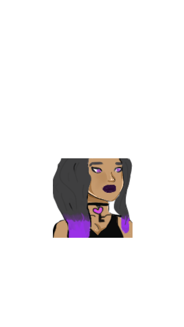
You can either redraw it so it fits the curved shape of the neckline:
Use whatever pen you’d like, however, for soft shading, I’d recommend the Pen Fade, and for hard shading I’d use the Dip Pen hard. You can use the airbrush, however, it’s a little difficult with learning how to use it so it looks good. If you are going to use the airbrush, use other pens along with it.
Layers, layers and layers. Use them! I don’t know if you did, but I can see the coloring mixing with the lineart on your image. Start on one layer and do the outlime. Then open a new layer underneath the outline layer and do the colouring there!


 good work.Never seen such a honest and detailed art review thread.but below is just a kind advice.


 I wasn’t sure where I was supposed to shade and what I was doing wrong but I completely understand now!