I’ve recently developed and improved throughout this month. Everyone has talent and I believe it’s your job, and yours only to make yourself a better artist.
Everyone’s a critic and that’s half the reason why I made this thread. Share an edit or a piece of art that you’re self conscious about. People all around forums can show you the beauty in your art and give you suggestions. :’)
Looks pretty good! However, the lineart–although smooth for the most part, is very choppy and messy especially in the hair area, as I’ve circled here:
You should strive to try and connect the lines of her locks to the top of her head, or the “part” in the middle, so it looks like actual hair locks rather than placing random lines everywhere. This will also help improve your shading & use of highlights in the hair as well. I’d like to add that you should’ve added more shading in places in makes senses at, like here:
I would suggest to sharpen up the lines instead of leaving it blurred. This makes the shading look a lot more realistic & better overall. If you’re still looking for the soft-shading look–I would suggest to still sharpen up the shading, then take the airbrush tool and lightly airbrush around the pre-made shading. This ensures you still get a soft-shading, but it doesn’t look too blurred.
The highlights here don’t make a lot of sense:
When you’re doing highlighting for brown hair, you want to make sure the highlights you’re using isn’t too white, but more of a pale yellowish color. Real brown hair doesn’t have white highlights. Also, I would suggest not using circles & airbrushing over it to stress the highlights, but rather making faint lines instead & then airbrushing over it.
The hand is really wobbly and sort of resembles a swollen hand. I would suggest thinning the finger tips, making the dips lower, and try making your lines straighter next time.
But overall, the art still looks great! Good job. I hope my criticism helps you in some way.
Super pretty! I love the ombre you did with her romper, it looks nice.
Thick lineart isn’t bad at all, but most people doing thick lineart would sharpen up certain parts of the lineart, such as areas like this:
If you don’t want to bother with that, then I’d suggest thinning your lineart out so the lines aren’t so thick & bold.
I have found that turning the lineart layer into an alpha layer & re-coloring the lineart with each darker corresponding color makes the art look significantly better in my opinion, as I’ve done on a piece I’ve worked on recently here:
As you can see, I’ve taken a much darker color on the same hue as my darkest skin shade & re-colored the lineart so it isn’t all black. Not everyone does this, and not everyone has to, but I’ve found it to make my art look a lot smoother & nicer on the eyes.
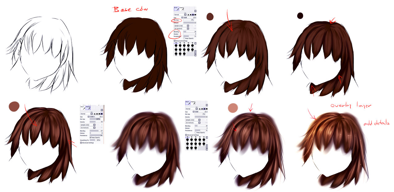
The hair shading is really nice! The only thing I’d say is that the hair shading is extremely harsh. I would suggest trying to soften it up a bit. I’m not sure if you’re going for a realistic hair-shading kind of style, or an anime, but here are some great tutorial pictures that show how to shade hair in both styles(not mine):
Also the lashes don’t really make sense either. Unless she put on some heavy eyeliner & thicc long lashes they wouldn’t sway like that. Refer to this image(not mine) of how lashes should look:
Like I told Neptune, I would suggest sharpening the lines rather then leaving them really blurry. Again, if you’re still going for a soft-shaded look, just sharpen the lines of your shading then airbrush around it. It’d still look soft, but not blurry.
For the most part, your shadows & highlights are placed nicely! Good job!
I hope my criticism can help you improve on your art further. <3
it’s beautiful for your first digital edit!
but i recommend making the lines more thick and turning stabilizer all the way up. also, when using the paint bucket, use it a layer underneath the outline so it doesn’t make the outlines look messy. maybe try adding more shading, contour and highlights and try taking up most of the page when doing one person edits. that way, small details will be more visible and easier to add. you can also try using the airbrush for shading and stuff to end up with something like this:
first?! i can’t even do that and i’ve been working on edits for a few months now!! insane talent!
the only thing i’d change would be the strand of hair on the shoulder. if you want to add hair that flow below the shoulders, maybe you shouldn’t put it that far away from the neck. but that’s just my opinion. i love the earrings and the shading. outstanding job!
Wow the coloring is super vibrant and gorgeous! Love the little highlights you did! All I would advise is to try & work on your proportions & hands more.


 how do I fix that—