Hey everyone! Welcome to “Background do’s and not do’s!” These are a few tips in making and improving your backgrounds and some lazy tricks I use. Feel free to comment below if you want to add to some points I made.
(Warning: Some points below may be my own biases, so please don’t get offended! I will try not to be mean as well, and I would love to have a civil thread)
Table of contents (I may add to this later on)
1. Perspectives in the background
2. Overlays and what it adds to a background
3. The theme of the background
4. My background pet peeves
_
- Perspectives in the background
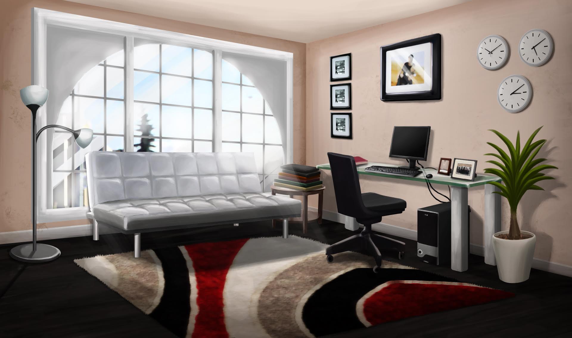
When we make backgrounds, most often the background creators I see around here try to make Episode-styled backgrounds- as in, not 3D rendered or real lifestyle. Mostly, what I say will be more about these backgrounds type. Of course, when we make backgrounds, we want to try to make it as realistic as possible. Therefore, the first thing is perspective.
For example, if I used this background:
And I placed this overlay here:
It would look out of place, and completely off. This would be because:
So it would look more normal if it had this position: (Excuse the bad drawing, but otherwise)
Another thing is this:
Now, this isn’t particularly incorrect, and in this instance, it isn’t that the perspective of the overlay is wrong, it’s the placement of the overlay.
For example, if you had a room like so:
Would you place an object like this:
Or this:
Usually, this happens in backgrounds where there are corners, and it’s harder to find an overlay with the same perspective was that background. (As in, aligning).
However, it also looks less realistic because ideally, it looks a little bit strange that someone put their desk or bed in such a strange position. (Obviously, that happens, but not so commonly).
As a viewer, you wouldn’t think of the overlay as an overlay, but more as something movable, not like an image. To the background maker, there isn’t another perspective of that overlay, but to the viewer (at least, I think) it’s like, “Why can’t the overlay be moved to match that wall?”
Here, for example, is an older background I made that has its flaws and its good points.
Here are the good points and bad points:
- Overlays and what it adds to a background:
Overlays are very important to backgrounds. In fact, that’s how we make our backgrounds- by adding overlays to them. of course, there are certain types of overlays that are very hard to crop, so you should try to avoid them. I’ll put a list of them below later on if you think you aren’t good at cropping. But what makes a background look good is if it doesn’t have overlays that have edges that are wobbly, leftover background dots, and white or leftover backgrounds edges.
From this background, I want this overlay:
Then which would look better?
Make sure you put that typ of overlay (with plants) in the back if it ends up looking like that (I’m still not good at cropping glass things, and I generally try to remove them or not use them) so they don’t stick out, or make it look less obvious.
Plants are also hard to crop, especially things like bushes and trees, so unless you’re great at cropping, I’d generally avoid those backgrounds as well.
Also, I’m not that great on tips, but when you crop, please try to avoid this little button here:

It doesn’t really delete a lot of the parts of what you want to crop. Another thing is when you want to crop round things, even if part of something else, like this:
But something is sticking out (let me zoom in)
- The theme of the background
This is pretty easy. When you make a background, make sure the overlays you use to match with what you are making, usually, it’s simple~ spaceship background, panels and space themed things. You know, unless there’s some huge reason, there wouldn’t be a random plant. you don’t want things to be out of place. of course, there is always that one time where we want to fill up space but we can’t find anything to put, which is hard. The art catalog actually has plenty of backgrounds, so we can find plenty of overlays make sure you look for overlays people haven’t already used. There are many just hiding in plain sight.
Another thing is lighting. For some backgrounds on the art catalog, sometimes we’re doing edits or adding things onto backgrounds. Take this background, for example, which is pretty common.
This background is special because it’s light is orange. Therefore, we should try to make it fit for the theme. For example, if I put this, it would look out of place. (Let’s ignore the fact that its art style is different from the background’s art style)
This is because of the lighting. So if we changed the lighting of the overlay:
Then it fits the background more.
Other than that, we can change the background’s lighting, etc. - My background pet peeves
Personally, I don’t like white edges or unwell cut overlays- (obviously, if some are hard to cut, I hide them in the background )
)
it’s fine if you put things unaligned with backgrounds- some things don’t need to be perfectly aligned, such as this, for example, but it looks naturally put,
Lighting actually doesn’t bother me too much, unless it’s very stark.
Here’s an example of one of the better lighting backgrounds I made (I think):
Although, some flaws include the balnket needing to be more lit up, and he surrounding wall behind the fireplace which I will go fix,
And finally, here’s a little trick I use when I make backgrounds that’s lazy.
As some of you know, I love to use one certain floor in my backgrounds (although I do change the colour of it). this one:
So let’s take that first.
Say we have this room:
And this room:
How can we use the same floor?
(We’re going to remove the floor from both backgrounds and use the shop’s)
First, I’m going to change the floor’s color to gray, just to match both of them.
I decided to just crop across the pillars on the first image’s right wall because I was too lazy to crop out the individual pillars
_
Anyways, we can see that the second image is much closer to us than the first image. Obviously, it would be much easier to put out the floor in the second image than the first since the shop’s view is also quite close. But the trick is what I call flip and narrow.
So let’s put it on the second image first:
For the first image, I’m going to show the “flip and narrow” trick:
I know I made a mistake, but it’s a bit like this:
(Aside from the perspective being wrong)
And it looks weird.
So this is the trick:
I know, I’m lazy!
So it’d look like this:
Sometimes, when the floor is in a different perspective, you can end up with a funny pattern, like this, but sometimes it ends up alright:
_


Alright, that’s it for today! I hope you learned something and feel free to argue!
*By the way, I hope I didn’t seem obnoxious or come across as snobby!
Edit: list of things to not crop:
Plants- Bushes, trees, flowers, etc
Glass items
Benches
Fences
Things with a lot of holes or long and narrow fragments
 ,
,
Toasty 
 You are one funny piece of toast

 BOOKMARKED
