I didn’t know what to call it but, there ya go. I’m gonna only do some certain types of art as I’m very busy and only really want to do things which I won’t have to spend hours on. Here’s what I am doing- Splashes Character Detail Page Things Profile Pictures Art Reviews
If you would like an art review, you can pm me the piece of art if you would like it to be personal. If you want it to be public, post it here but I will post my review here. WARNING: I am brutally honest when it comes to stuff like this soooo…if you don’t want me to be mean to you, go find someone who lies and let’s you down softly
Rules-
•Don’t ask for examples, you’re just gonna have to wing it! Some of you know what my art looks like soooo…
•No Drama, I will report you
•Don’t request the same things on other threads unless it’s an art review
•Don’t ask when it’s done! I’m very busy so it may take up to a few days
•I have the right to decline your request
•The password is- Chocolate
•You have one re do, just say if you don’t like it because I’m also still improving
Splash Form
Background-
Writing-
Theme-
Number of characters-
Character details-
Extras-
Animations-
Character Details Page Thing Form
Background-
Font-
Character details-
Character screenshot in animation-
Profile Picture Form
Background-
Character details-
Character pose-
Drawn/not-
Extras-
Writing?-
Screenshot-
Art Reviews
Piece- (or send it to me in PM)
What you want the review specifically about- (May be the nose, skin etc or the whole thing)
Art.1-
•Loving the tattoo, it really stands out and catches my eye.
•The fingers look a bit sloppy and uneven, I also struggle with this because they usually end up too big or too small but a good attempt.
•I actually thought the girl’s arm was her torso! I was thinking you’d forgotten to add the rest of her shirt but realised it was her arm. Maybe add a bit more texture to make this clear?
•The hair does look a bit strange on both as it’s only really been shaded in certain areas. I recommend watching some hair tutorials to help adding strands or better highlights.
Art.2-
•There are a LOT of white patches and weird pieces missing. You should go over it and fix these up to make the quality of the overall piece better.
•Again, the hands looks a bit strange. They have no shape to make them pop out because they look a bit flat just…there.
•The arms look like misshaped bananas…Maybe try redrawing these bits, just keep trying u TIL you get that desires look.
Art.3-
•I honestly love it! I don’t really have anything to improve on it because everything is so smooth and fits in perfectly!
Art.4-
•The hair is a very strange shape… try practising on an empty canvas with a head with all shapes and see what you prefer and what you should avoid doing.
•Similar to the first piece, the hair shading is only really focused in one place. You should try a tutorial.
•The Gand is a good shape this time but is in a very awkward position grabbing that phone. Maybe try re drawing this bit to make it in a less awkward position.
Here is my opinion on all of your art! Come back soon
Art.1-
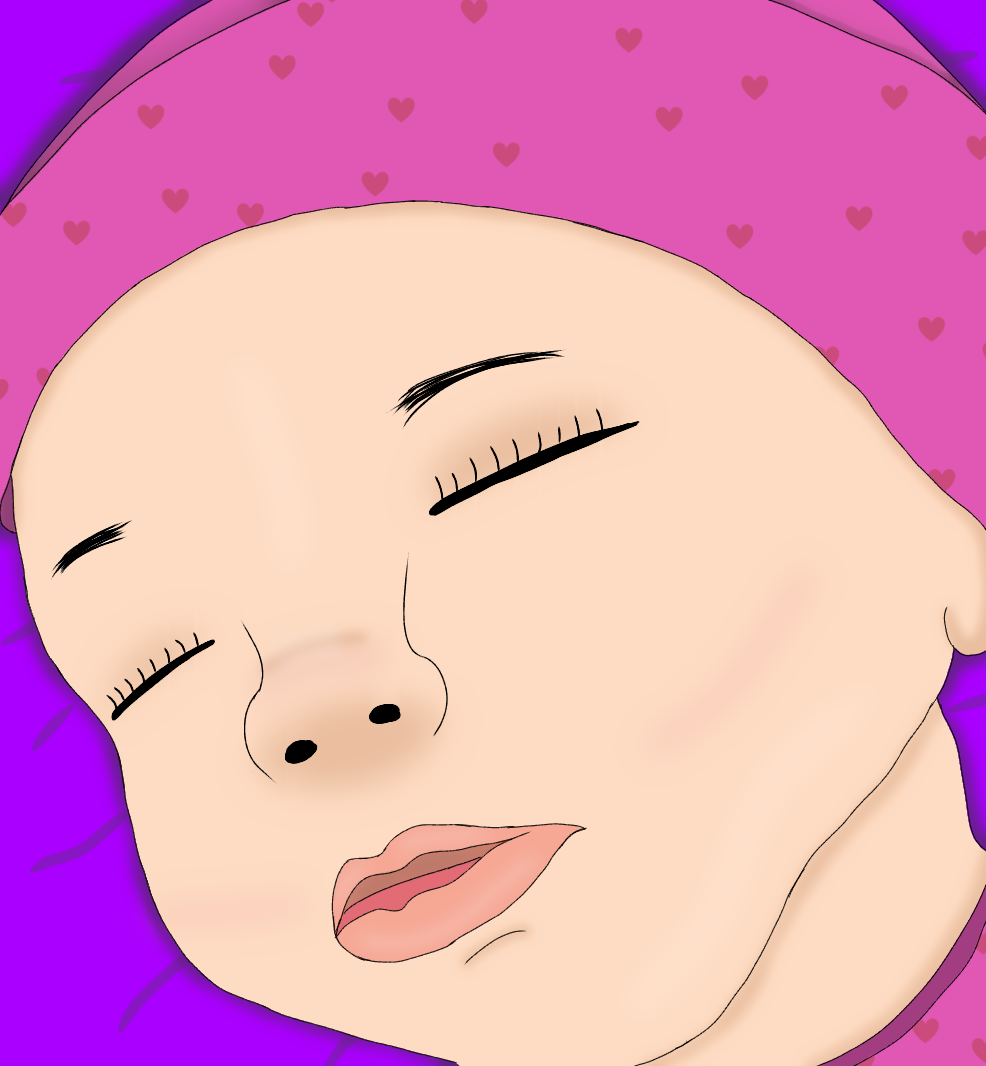
•The overall piece is so cute I am a sucker for babies
•Eyelashes aren’t just sticks coming out of that crease thing. They look very spread apart which makes me think unrealistic. Maybe try adding more of them, not just sticks but with texture. I think that there are some tutorials out there on how to do this.
•The left eyebrow just suddenly seems to…stop. I know what you were trying to do but it looks a little too short, so make it a bit longer so they look a bit more similar but with that positioning angle.
•Some people may not agree with me on this but I think you should blend out the patch on its nose a bit more. If you were trying to create a dirt affect, you could try a darker colour or a different brush to lay it down with so it doesn’t just sit there.
Art.2-
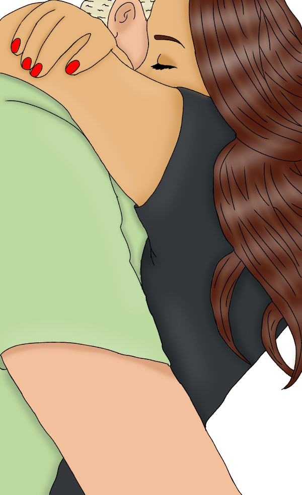
•The eyes really could do with a bit more highlighting. All I can really see is the shadows and if someone is crying I can see their eyes more shiny.
•Those knuckle things kinda look like wrinkles, I recommend getting rid of them or blending them a little or making them match a little more to the skin tone so they don’t give off that.
•Has he painted his nails? When I usually see them, they’re lighter than the skin tone. Or you could go with the episode style and not have them.
•I see what you tried to do with the cheek shading… please blend it a little more. It looks a bit like you just left it like a strip on his cheek when in reality you wanted to create an effect.
•The baby he’s holding’s eyelashes are sticks. Like I said with the previous piece, eyelashes aren’t just stick coming out of your eye, there’s lots of them even in babies. They also have a little more volume.
This was my honest opinion, and yes I have been a bit brutal. I hope this helped. Come back soon
I’ll try and learn how to do hands, I’m not very good at them.
Also on the one where you said there weird white patches, it’s because that’s an effect and not part of the actual drawing.
If you have any idea how; could you tell me how to make the lines look like they aren’t pixelated when you zoom in and out? You can tell they are, but I don’t know how to fix that if there’s even a way to do so.
Thank you so much. Eyelashes I suck and them I will try again on that. The baby nose I see what you mean I need to blend it more and ill fix her brow. I don’t know how to make his eyes glossy it’s my first time doing the crying in a art and I’ll change the nails to lighter thank you for that tip. I will use everything you said to make my art better and to make these two better. When i get my next one done can you look at it also?


 I am a sucker for babies

 it’s my first time doing the crying in a art and I’ll change the nails to lighter thank you for that tip. I will use everything you said to make my art better and to make these two better. When i get my next one done can you look at it also?