SORRY, BUT THE VOTE IS CLOSED. THANKS FOR YOUR PARTICIPATION! 
Here are some comments:
I agree with xxxxx , the first cover just leaves you more curious  It looks cool ^^
I choose the first cover bc of the texture of the cover gives it a dramatic touch tbh I really like it. The way it was made makes me feel like the story mysterious . This cover gives me an nice strange vibe and also mysterious. It fits the story the best.
I chose the first one because I liked the rusty look, made it look mysterious and interesting!
The first cover looks more mysterious, and personally i’d click on a story with that cover right away. The second one was good too, but the first one left me wondering what will happen.
I choose it because it looked more interesting and intriguing. When you see the cover, you imagine what could it be about. And edit is done nicely.
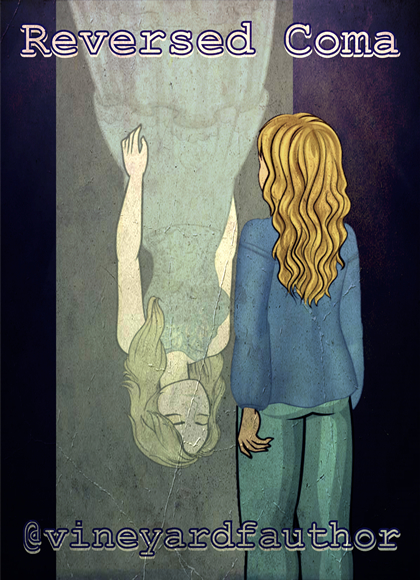
I like how it mirrors both characters its more artistic but it’s not too much. If that makes sense
I really like the heart line on the second cover, it made the imagine much more related to the title!
The second one goes along better with the title and theme than the second one, and it looks a little more abstract. This is like saying how when you try to edit a background from day to night, it looks more realistic if the lighting is turned to blue. It’s less well defined than the first one and there’s a smart color theme (gray and blue, which blends) and it gives a blurry illusion (not actual blur). The lines (purple and green) are what shows the story cover theme the most. When reversed, you think of time, and you think of a timeline, or up’s and downs- the fizzy patterns when an electronic is going haywire- this patterns remind you. Furthermore, it gives a contrast to the background but doesn’t take it away. I hope this helps! 
And, the FIRST LOOK of the story cover will be presented on 1 DECEMBER 2018 . So, bookmark your calendar.