Happy Halloween witches!  Tell me your thoughts on this one please
2 Likes
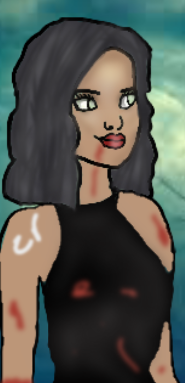
BEFORE YOU ASK ! IT’S A VAMPIRE ! Well…it’s supposed to be one lol
It’s great!
I would recommend editing it with higher pixels so it looks more rounded instead of pixelated.
I would add some fangs to her, since she is a vampire.
Lastly, the blood could be improved!
Again, if you had higher pixels, the whole edit could be improved!
I think you’re a great artist, and if you ever need help, pm me!
Awww! Thanks so much! Do you use ibis paint ? I do and I don’t know what brush to use so it looks not so pixelized
1 Like
Do you use dip pen hard? That’s what I use and the lines are better quality.
I think most users use IBIS but I don’t like it.
I use medibang just because I prefer it more 
1 Like
Awesome thanks 
1 Like
Would you make an edit for me?
Sure thing! Details please?
Send them on my previous thread or pm me or even here I gues
I would also like it better if you sender me a pic off her
Just a cool edit of my character👍
Ink
Skin:Tan
Nose:Upturned
Mouth:Full round
Hair Colour:Chestnut
Hair:High ponytail
Face:Oval
Brow:Thin round
Thnx soo muchxxxxx
1 Like
Just about to send pic💙xxx
1 Like
No problemo 

It’s is! I’ll do when I have free time
Kk thnxxxx
Looks fangtastic 

1 Like
Things I noticed:
- When you put shine on the lips, it shined the line that separates the lips as well.
- The lines look thick and pixelated.
- You did a great job on the lips. I see a lot of edits where the lips look awkward, but they look great in this one! I can’t do lips for shit, lol.
- The hair looks awkward where it just abruptly ends on the left side. I think you should either complete the waves in the hairstyle or sort of put the left side of the hair behind the girl’s back.
- The blood looks like red blurs, kind of. I would suggest (if you’re blurring the blood) to tone down the blur a bit, like maybe by a quarter? Oh, and maybe use a darker shade of red.
- The nose doesn’t look awkward! Like, how?! XD Good job on the nose, but I would suggest using a teensy teensy bit smaller brush for it (maybe lessen the width by 2-5 pixels?).
- The eyes look better than I could ever do, but I would certainly suggest blending them together a bit, the shading next to the white looks abrupt. Also, maybe use a smaller brush (2-5 pixels smaller maybe?) for the eyes.
- I would raise the eyebrows a bit, then maybe blur them a tiny bit. Again, just me- you don’t have to do any of these suggestions if you don’t want to <3
- The color of the hair kind of blends into the lines for the hair a bit; I’d suggest putting the hair color in a different layer, if your program uses layers <3
- The hair kind of just looks… infinite; like there’s no scalp. I would suggest to draw the sides of the hair from one side of the scalp at a time, instead of just coloring in the outline of the hair.
- White lines around the character where you used filling.
- Maybe you could add bigger blood spatters and rips? That’d be cool.
I think you did a great job; better than I could ever do! And happy early Halloween to everyone, if you people celebrate it!
Rock on
1 Like
I don’t really know the brushes that well lol
1 Like