I mean… it’s not advanced or nun like that but I mean look at them smexy faces I just can’t… ANYWAY!!! Tell me what you guys think and some improvements
CHAT TIME!!!: Hm lets see… Let’s have a chat about 2 different things actually 1. School lunch And 2. TRUTH OR DARE!!! If not willing to do a dare just tell something funny about yourself I guess LETS GOOOOO!!!
P.S I’m very hyped right now if you didn’t notice and tbh idk why…hehe
I agree with @Danielle318 and maybe you could remove those zoom and other buttons at the side.
Also make the title another color or move its placing because it is a bit hard to read
You could try removing the buttons at the side and adding an interesting background. The black text is hard to read and it’s too small to see on the app. I don’t know why you added the Instagram logo twice, and you should probably use your episode author name instead of your Instagram handle. Also, isn’t this too square for a cover?
 what ya think about mah cover peeps?!?!?!1?!?!
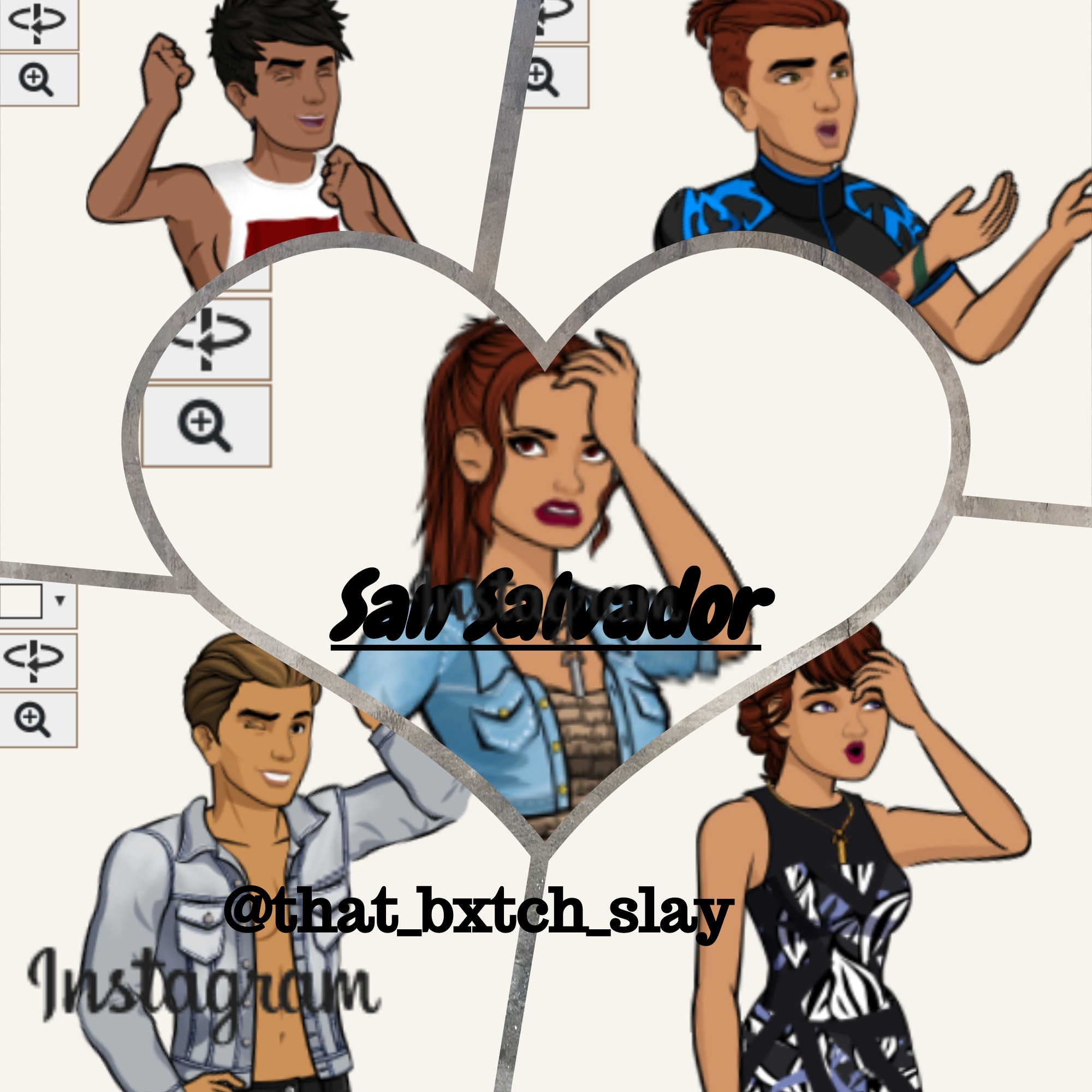
 I just can’t… ANYWAY!!! Tell me what you guys think and some improvements
 And 2. TRUTH OR DARE!!! If not willing to do a dare just tell something funny about yourself I guess

