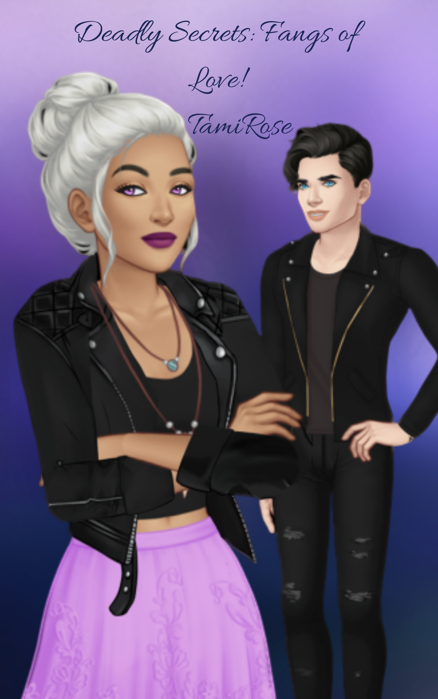
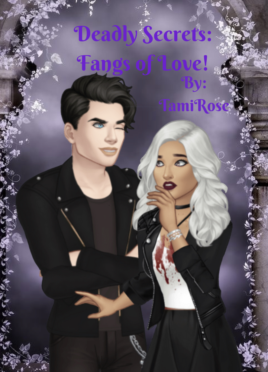
I tried to do a poll but I don’t know how. Anyways, I had to do a new cover because of guidelines and because I suck at it and can’t decide, which one looks better.
I’d say the first one looks better. I love the colour scheme and their position and expression a lot.
Maybe you could make the title a bit bigger so it’s easier to see it, but both are lovely!
Probably both. Just IMO (and I’m not artistic btw so take anything I say with a grain of salt lol), the title doesn’t really pop, especially on that background.
This is obviously just a suggestion and of course other people might not agree with me but I just feel like the font could be more eye catching? Like this? (But obviously ignore the fact I blurred your text out and it could be better. I chose the fonts quickly.)
Omg, I love that version.
I actually chose A because B was too blurry to mee, but with the better quality and the new title I think this version is awesome.
I would put “Fangs of love” more to the right though
Um actually I like that first font style would you mind doing the title for me then? Sometimes I get stuck in a funk and can’t figure it out. If that makes sense haha


 and thanks to @EliseC for the fonts


 but I just feel like the font could be more eye catching? Like this? (But obviously ignore the fact I blurred your text out
  and it could be better. I chose the fonts quickly.)

